Simplicity template
Simplicity is a website theme that looks much like a real paper - though it may grow infinitely in length. It was designed for simple content publishing.
This is both a demo and the documentation at the same time.
Installing apps
Note that the list of apps demonstrated on this website is not the full list of available apps. Check out the Boomla Store for more.
Gallery
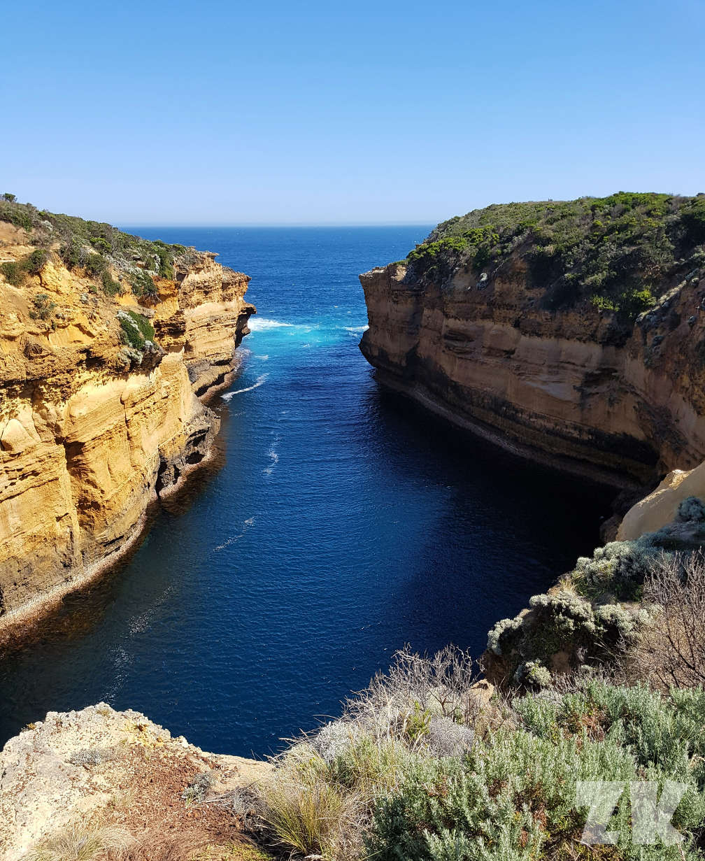
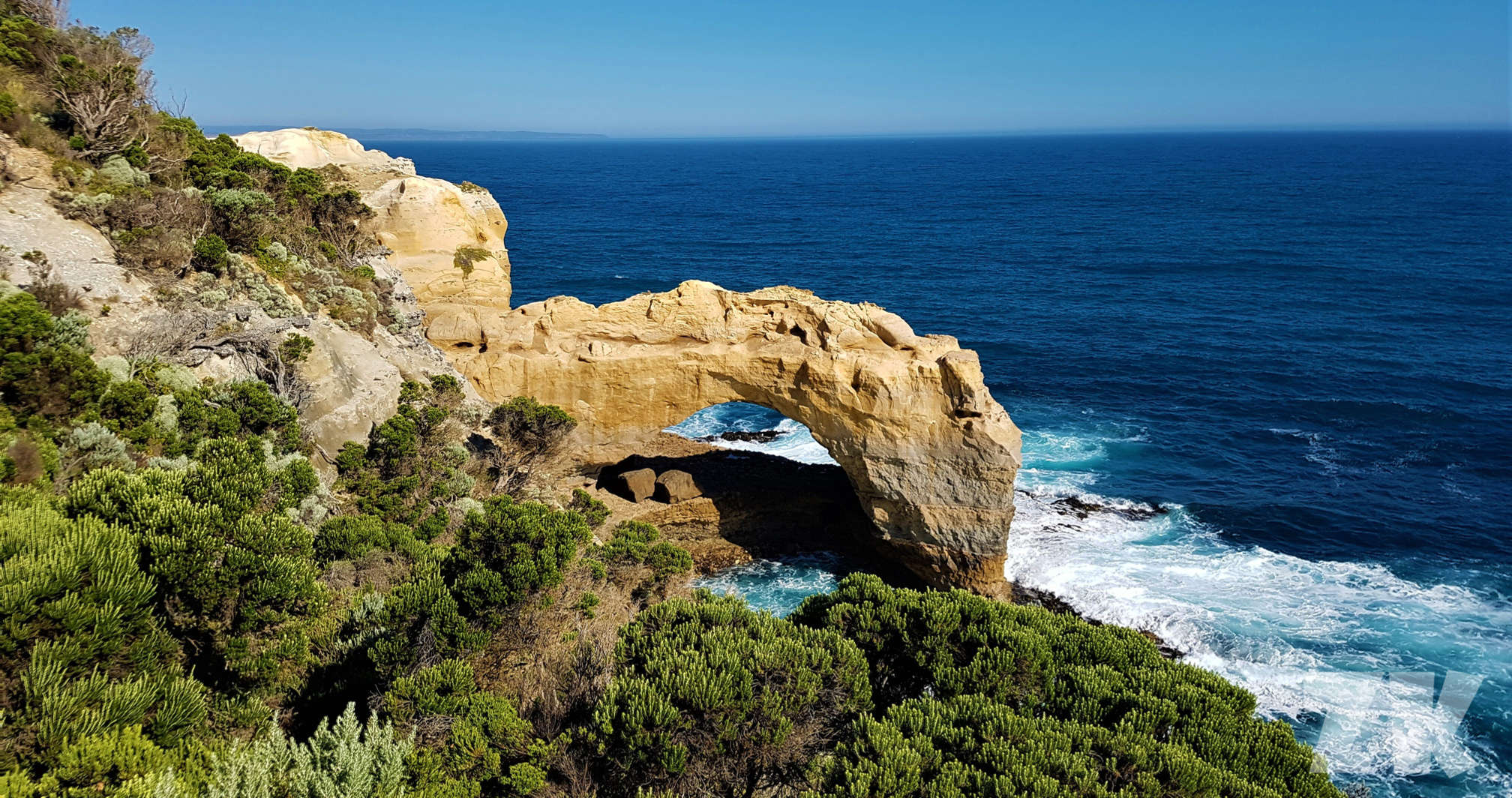
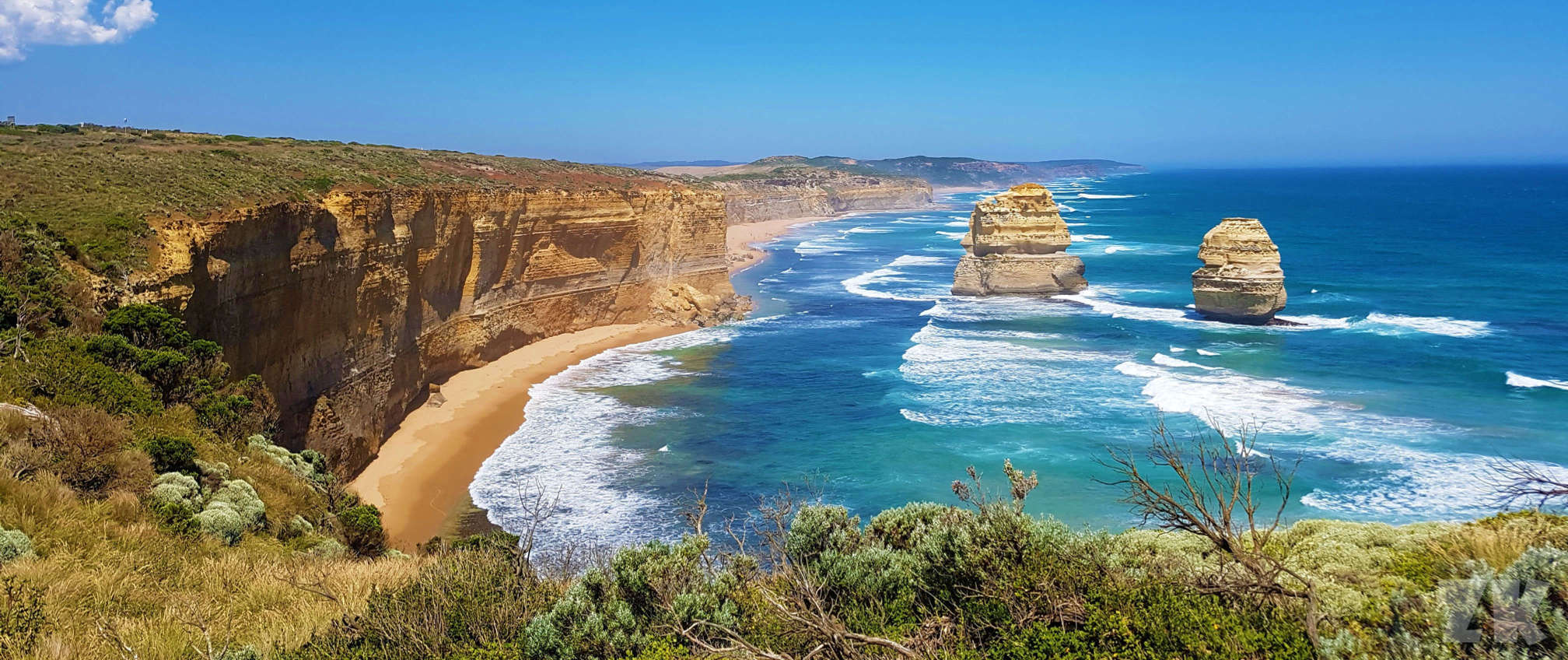
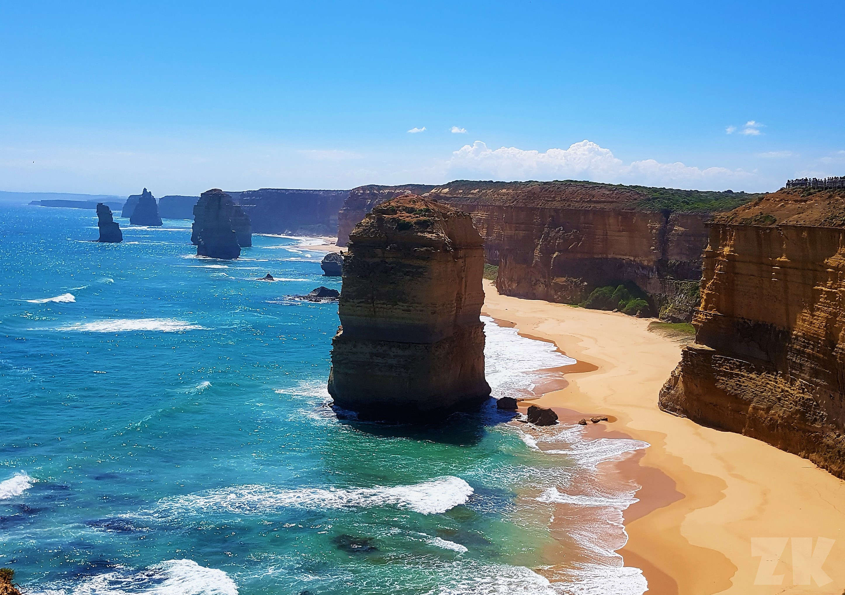
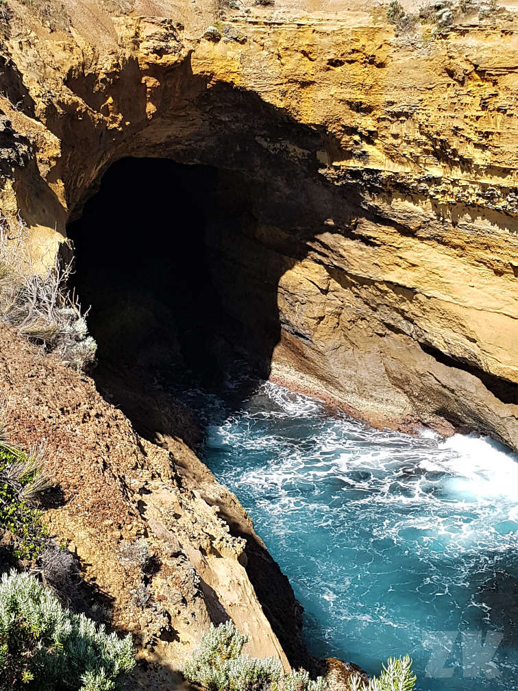
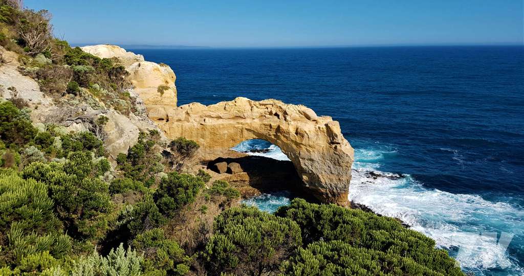
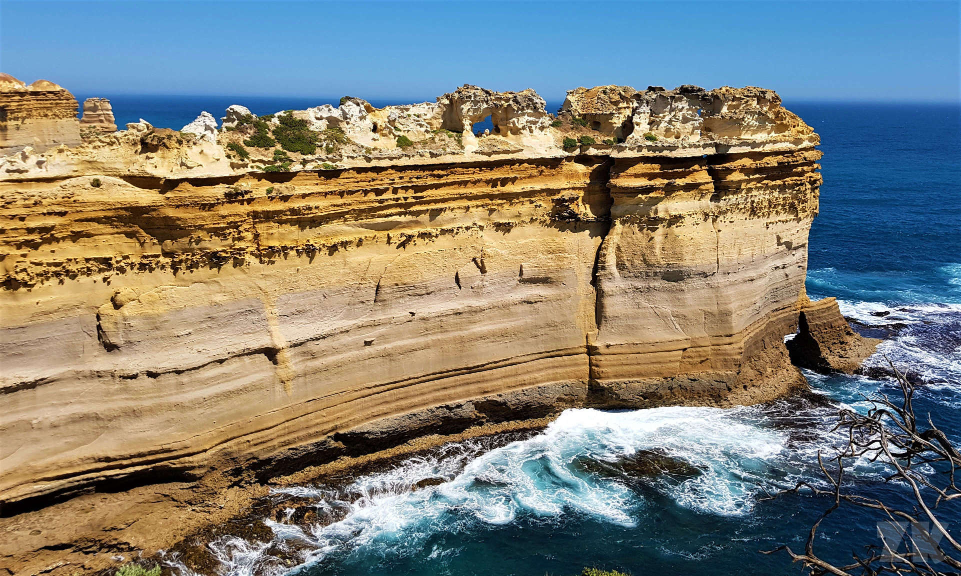
The gallery app is automatically resizing the images so that you don't have to. Click the images to see them enlarged. To upload images, just drop them into the gallery from your PC. For a more detailed documentation, visit the gallery app's website.
2 columns
You can split any content placeholder into 2 separate columns. This allows you to organize content neatly. Each column will grow on demand. If you feel adventurous, you can also split the resulting columns further. | Lorem ipsum dolor sit amet, consectetur adipiscing elit. Aliquam sit amet tellus non ante finibus finibus. Morbi orci augue, gravida venenatis neque in, facilisis semper mi. Donec ac lectus eget nisl consequat tincidunt. Pellentesque in enim ut orci faucibus pulvinar a eget diam. Fusce posuere est at porta ultricies. |
3 columns
You can also split placeholders into 3 columns. Docs. | Lorem ipsum nisi vel dapibus sodales, turpis dolor lacinia lectus, sit amet auctor arcu tellus sed libero. In mollis pretium efficitur. Integer sit amet congue velit. Etiam in dui at odio scelerisque aliquam. | Lorem ipsum dolor sit amet, consectetur adipiscing elit. Integer nec odio. Praesent libero. Sed cursus ante dapibus diam. Sed nisi. Nulla quis sem at nibh elementum imperdiet. |
Composing
The cards below are not standalone components, rather, they are assembled from a 3 column splitter, each containing a gallery with an image at the top, and a text below them.
|
Praesent libero. Sed cursus ante dapibus diam. Sed nisi. Nulla quis sem at nibh elementum imperdiet. Duis sagittis ipsum. Praesent mauris. |
Duis sagittis ipsum. Praesent mauris. Fusce nec tellus sed augue semper porta. Mauris massa. Vestibulum lacinia arcu eget nulla. |
Vestibulum lacinia arcu eget nulla. Class aptent taciti sociosqu ad litora torquent per conubia nostra, per inceptos himenaeos. |
Center
You can create a centered container within a placeholder. This may hold anything, like text, or an image. The image above is actually wrapped in a gallery, which allows viewing it in full-screen mode, plus one can enforce the desired image proportions.
Accordion
Accordions show one of the many content panels at a time. For example, it is useful for creating F.A.Q. secitions.
You can also configure which accordion to open by default.
Attach files
You can attach a list of files to the page for downloading, like in the list above. Docs of the files app.